
December 21, 2023 — Why maps? Well, as someone once said, "a map tells you where you've been, where you are, and where you're going — in a sense, it's three tenses in one."* As risk managers, we read things like hydrologic maps, fault zone maps, maps showing where the meteorologists think a hurricane is heading. Many risk metrics can be derived from maps. The Environmental Defense Fund and Texas A&M University have combined forces to compile a new, interactive map that profiles a number of changing risk factors (fire, flooding, pollution, drought, etc.) for each census tract in the US — some 70,000 reference points in all.
This is a remarkable new tool. Clicking a report for a census tract yields details on heat, wildfire smoke, and drought, in addition to what drives vulnerability to extreme weather, such as income levels and access to health care and transportation. This resource was initially designed to assist communities in understanding local risks for political and administrative purposes, such as tapping into federal assistance programs, but it clearly has potential uses well beyond that fundamental purpose.
We find the map's granularity especially intriguing. For example, if you have many different locations scattered across the US, might this help you enhance and update your exposure profiles beyond the usual metrics of construction type, square footage, roof composition, and so forth? We also find the differences in some risk factors, even in areas geographically close, to be remarkable. For example, the risk profile of north Seattle is very different from that of south Seattle. Check out this example from the new mapping app:
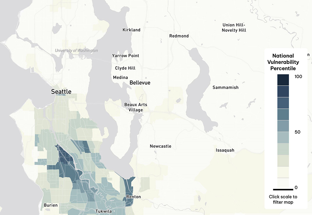
This is just one example, of course, and we need to explore inside the National Vulnerability Percentile rating for each area to resolve specific risk factors, but it gives us an idea of what level of information is now available.
This new resource is only one instance of the relative flood** of new or improved risk tools that are becoming accessible. The United States Geological Survey (USGS) recently updated its entire hydrologic map application to reflect new flood information. Some areas we used to think were relatively flood-proof are turning out to be not so high and dry in the light of new data.
Tolkien tells us that when setting out to create The Lord of the Rings, "I wisely began with a map." Maps can tell us a great deal. Are you consulting the new maps, tracking the ways in which risk changes and moves about?
*Peter Greenaway, movie director, writer, philosopher
**Pun intended
Author

Dr. Gary Anderberg
Make Gallagher Bassett your dependable partner
When making the right decision at the right time is critical to minimize risk for your business, count on Gallagher Bassett's extensive experience and global network to deliver.